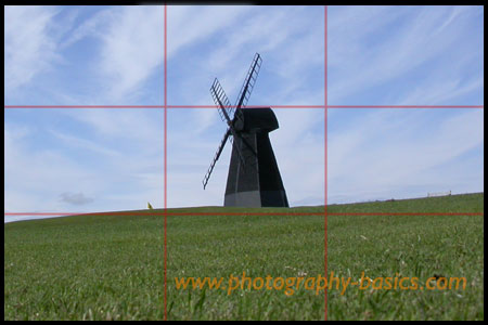
I mentioned in my overview of composition that one guideline is called the Rule Of Thirds and this involves dividing the image into a 3 by 3 grid like this:

You can see in this example that the windmill is placed in the centre of the frame. This goes against the rule of thirds which says that you should put the main object in the image on one of the dividing lines or the intersecting lines.
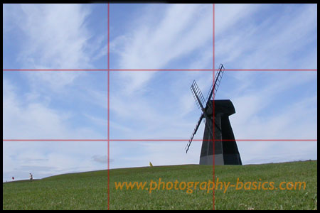
This next image applies the Rule of Thirds which is meant to be a more eye pleasing image.

If you can ignore the grid lines, see which you think is the better image and let me know if you agree with the Rule of Thirds.
Cool – thanks a lot. Like most people I have always put the object in the middle!
I get the rule of thirds, but why is it so? Why is it more pleasing to not have the main object in the centre?
The rule is very much a subjective one. Some people may prefer the image to be in the centre and sometimes it is better to have the image that way, but generally, the composition is more pleasing to have the main focul point off centre. As for why? Well, that’s a good question, and to be honest I don’t know if there is any science behind it. Most people like to be drawn into the picture with the composition, the term ‘leading the eye’ is used a lot, and to lead the eye into the picture to get the main area of interest, having it off centre does work better… for most people. It’s worth trying to compare images, and take some yourself of the same subject and just see what sort of compositions look right, and which don’t look quite right in your mind. More often than not, an image that complies to the rule of thirds will sit better in your mind than one that is centrally placed.
I rather have the main target in the middle, it stands out more.
Some people like to see the subject right smack in the center of the photograph. I can’t understand their thoughts.
I agree with the rule of thirds. The photo with the windmill to the side seems to work better because your eye focuses not only on the windmill, but on the surroundings too so you take in more of the photograph.
Garry!
Thanks alot for ur amazing tips and explaination u offered us! honestly this is helpping me alot!!
this seems to work only for landscape oriented pictures, what about portraits?
The rule of thirds (or guideline of thirds) still holds for portrait or landscape shots although it may be less obvious for people portraits. Take this example: http://www.flickr.com/photos/gazraa/3576184509/in/set-72157618890412831/ As he is not facing the camera, it’s a little easier to position the person off centre. If you put a thirds grid over the shot you will see that the gentleman’s head is just about on the top left third. Face on, then maybe it would be less obvious. Don’t forget though, it’s a guideline, not a hard and fast rule. Experiment and find compositions that you are happy with.
i think it has something to do with eye movement. we much rather not look at something head-on (at something that’s right in the middle). it feels like we are forced to look at it. by keeping to the side, eye chooses to look at it. the eye generally tends to see whats on the right first. which is usually why we see ads placed on the right-bottom side of the newspaper.
That’s all the rule of thirds means?
– thanks for the simple explanation.
Photography is such an absorbing subject.
photography-basics is always worth referring to.
thank you for stuffs..